![certainly-logo-full-colour-rgb-2.png]](https://support.certainly.io/hs-fs/hubfs/certainly-logo-full-colour-rgb-2.png?height=17&name=certainly-logo-full-colour-rgb-2.png)
This article provides a nontechnical explanation of the configuration of the Certainly Widget.
Below, we'll explain how to go live using the Certainly Widget, as well as how to customize both its behavior and styling.
We'll address:
- How to implement the Certainly Widget
- How to customize the behavior of the Certainly Widget
- How to style the Certainly Widget
Feel free to grab your web designer before we dive any deeper!
How to implement the Certainly Widget
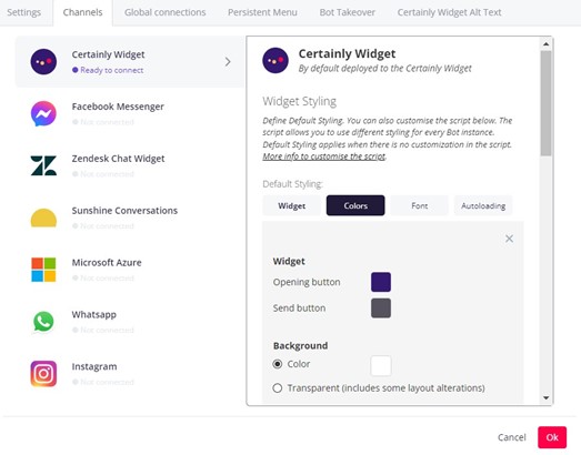
The widget script will enable the chatbot icon on your website. To access this, open the right sidebar menu on your bot-building canvas and select Bot Settings. Navigate to Channels > Certainly Widget.
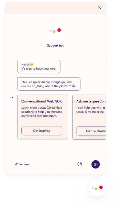
Underneath the title "Embed the Chatbot Widget on your website" is the script you'll need to copy. The script should be pasted right before the </body> tag on your website. Then a button will be displayed on the lower right side of the website.
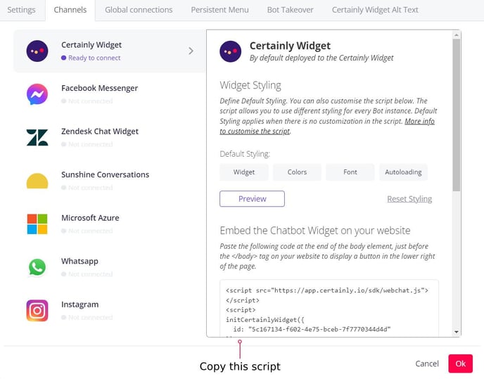
This is the standard out-of-the-box Certainly Widget. Keep reading to learn how to change the widget's behavior and style it!
You can also check out our technical guide to implementing the Certainly Widget.
How to customize the behavior of the Certainly Widget
In this section, we’ll explore the various ways you can alter the behavior of the Certainly Widget. We'll help you:
- Find your bot’s deployment ID
- Resume existing conversations with end users
- Enable autoload
- Display the debugger alongside the chat
- Identify each chat instance when multiple bots are deployed
- Set the webchat greeting text
- Pass Custom Variables through your script
- Start the widget at a specific Module
- Enable voice control
Find more info and the code snippets for these properties in our technical article.
Find your bot’s deployment ID
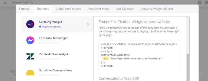
The deployment ID (id) of your chatbots links the script specifically to your bot. The value may also include some referrer ID as a URL parameter, which will take the bot to launch the conversation on that specific Module.
The bot deployment ID can be found in Bot Settings. After you navigate to Channels > Certainly Widget, you just need to locate “id” in the widget script. The value found here is the deployment ID for that bot.
Resume existing conversations with end users
When the widget is placed within a secured area (behind log-in session), it may be handy to store the uId (uid) of the end user together with other session metadata, so the host can use it later in another browser or device to resume the existing conversation with that logged-in user.
The uId identifies an existing Certainly conversation. If specified, Certainly will resume the existing conversation instead of starting a new session. You can retrieve the uId through the certainly.getUid() method.
Enable autoload
Using autoload can make your bot automatically pop up. This is great if you want to initiate contact with the customer using your bot. Please note that this functionality does have some channel limitations.
The autoload functionality can be configured directly from the bot-building canvas. Access Bot Settings from the right sidebar menu, navigate to Channels > Certainly Widget, then select the Autoloading tab in the Default Styling section.
To use this feature, you'll set a specific time in seconds, a scroll down in pixels, or a mix of both.
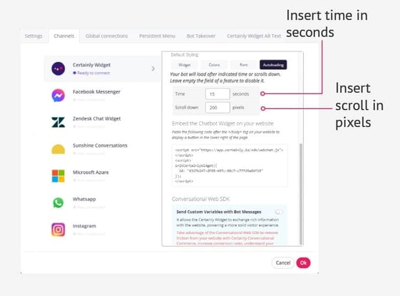
You’ll want to consider how best to engage the end user with the bot. For some, it can be better to wait a certain amount of time before the chatbot pops up to be sure the user is on a relevant site and won’t immediately bounce. Engagement can also be translated into scrolling: if a customer scrolls down, it could be a sign that they're looking for something or reading.
When the bot pops up, it only showcases the bot avatar and greeting message until the user clicks the text field. When the text field is clicked, the bot starts firing messages based on the starting Module or referral URLs you’ve inserted into the script.
For live bots, be aware that when you add a time and/or scroll in pixels, lines of code must be added to your bot’s script. Learn more about the autoload property in our technical resource.
Display the debugger alongside the chat
Displaying the debugger is especially useful when developing your bots. By adjusting this property, you can follow the path the bot takes through the conversation and identify areas needing improvement while you're testing your bot on your website.
Below you can see the debugger displayed in the Tester. Click the gray left arrow at the bottom center to hide it.
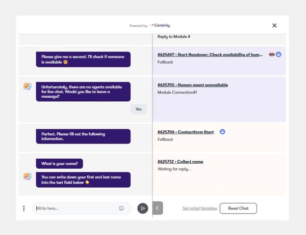
You can display or hide the debugger via the script with the debuggerMode parameter.
Identify each chat instance when multiple bots are deployed
The webchatKey is a unique identifier for the webchat widget. It is helpful when you have multiple widgets deployed on the same webpage and want to, for instance, link particular actions to them.
Set the webchat greeting text
You can edit the greeting at the top of your widget in Bot Settings, accessed via the right sidebar menu. This could be a welcome message for site visitors or your bot's name. The greeting appears directly below your bot’s avatar.
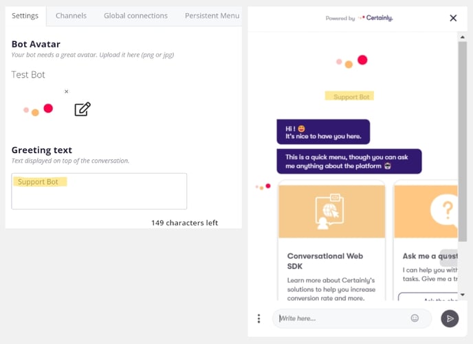
You can read about the greetingText property in our technical guide.
Clear past conversations
By default, a bot is set to display prior conversations to returning users.
However, you can ensure that previous messages are deleted by disabling the "Show Previous Conversations" feature. Once disabled, any page reload will result in the chat starting from scratch. To do so, navigate to Bot Settings > Channels > Certainly Widget. Select the Widget tab under "Default Styling", then scroll to the "Conversation" section shown here: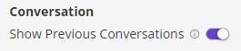
Alternatively, set the mode property to clear_past_conversations directly in the script.
Pass Custom Variables through your script
It can be useful to pass Custom Variables (cvars) through your script when, for example, you want to assign a specific tag to customers who have access to a particular webpage. These Custom Variables can then be used throughout a conversation.
Start the widget at a specific Module
Want to integrate your bot on several pages but greet users in different ways? You can do this by using referral URLs.
To find a Module's referral URL, you will have to go to the Message or Connections tab of the Module that you want to be the starting Module for that page. Once there, you'll click “Copy URL link”. A pop-up window will appear, and you can then copy the script for your website.
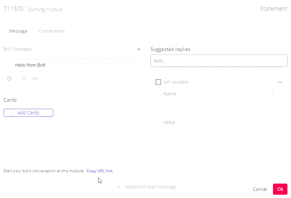
This script should be inserted in an HTML file before the </body> tag. You can do this with a number of different Modules and insert them into the different subpages you have. In that way, the chatbot will start differently on multiple pages.
You can also learn about passing a Module ID of the bot as ref in the technical explanation of this property.
Enable voice control
As of October 20th, 2020, the Certainly Widget supports voice control. Certainly Voice leverages the browser's built-in text-to-speech and speech-to-text functionalities. To enable this feature, refer to our technical explanation of the voice properties.
How to style the Certainly Widget
In this section, we’ll address the various ways you can style the Certainly Widget. Styling can be a crucial part of integrating your chatbot onto your website, as the format, look, and call to action can be essential to attracting traffic to your bot.
We’ll explain how to edit the following properties to customize the widget's appearance:
- Widget size
- Widget position
- Button icon
- Button dimensions
- Button color
- Background color
- Fonts
- Message styling
Find more info and the code snippets for these properties in our technical article.
Widget size
If you want to adjust the size of the chat, you can change the width and height of the webchat window. These are measured in pixels. You will want to make sure that these properties are set in accordance with each other to maintain the desired ratio.
To edit this, navigate to Bot Settings > Channels > Certainly Widget, then select the Widget tab under "Default Styling", as shown below. The “Widget Size” fields allow you to adjust the dimensions by pixels or the percentage of the browser window you want the widget to take up.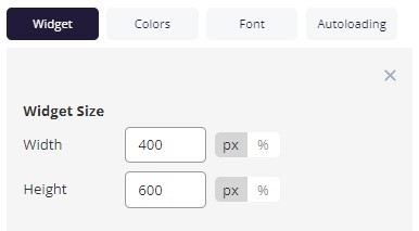
Or, adjust using the width and height properties within the script.
Widget position
Similar to Widget size, the "Widget Position" fields allow you to adjust where the widget is located within the browser window. You can decide where the widget button lies in respect to the right and bottom side margins, measured in pixels.
It is also possible to adjust the z-index, which specifies the stack order. This determines where the widget is in relation to other elements on the webpage. The greater the stack order, the further to the front the Certainly Widget will be.
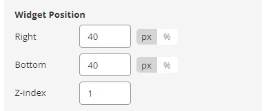
You can also edit the right, bottom, and zIndex properties via the script.
Button icon
The standard chatbot widget icon can be replaced with a custom image such as your company's logo. You can also change the icon based on whether the webchat window is closed or open. To do so, you'll need the URL of the photo you want to replace the standard icon with.
To adjust the icon, read about buttonLogoOpen and buttonLogoClose in our technical article.
Button dimensions
If you want to change the size of the widget icon, you can adjust the width and height of the button in pixels. Make sure the width and height are set in accordance with each other. If you have customized your button icon, set these dimensions to align with the width and height of the image you have selected.
Learn how to adjust the buttonWidth and buttonHeight in our technical guide.
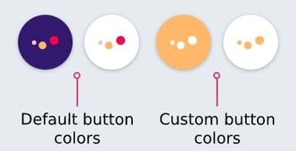
Button color
You can change the color of the chatbot widget’s button. Navigate to Bot Settings > Channels > Colors, then select the desired color for "Opening button" under “Widget”. If you're using a custom image as a button icon, that image will take priority over your color settings.
The button color changes when the widget is opened. Here, you can see an example of the default button colors as well as an instance where a different color has been selected:
Note that you can also adjust the color of the "Send button" from this screen. A customized example is shown below.
You can also learn how to customize the buttonColor in the script.
Background color
The background color of the widget can be set to a specific color code, as shown below, or you can make it transparent.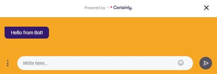
Adjust this under “Background” in the Colors tab of the Certainly Widget Default Styling options. Alternatively, refer to our technical guide to set the background color within the script.
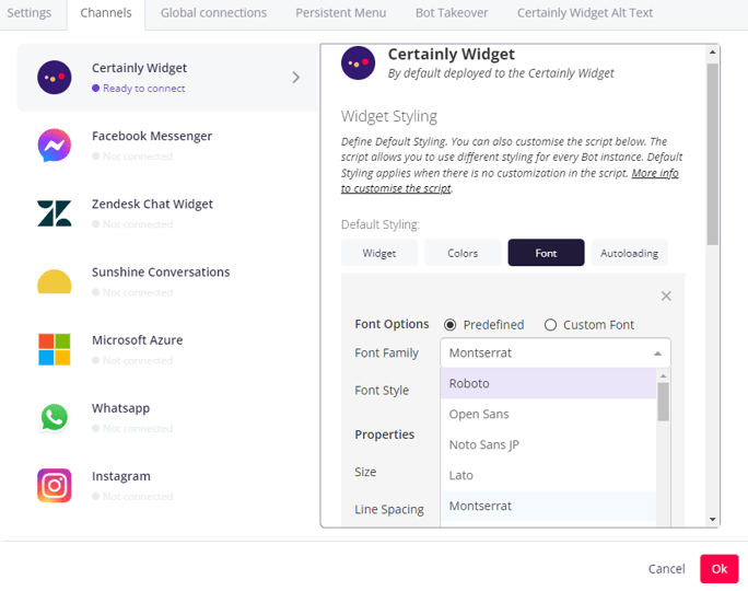
Fonts
You can choose between different fonts available by default, or you can use a custom font. Navigate to Bot Settings > Channels > Certainly Widget. Under the Font tab, you can select one of the predefined fonts:
Or select the option "Custom Font" to define your own font-face inside the editor and apply it to the Certainly Widget:
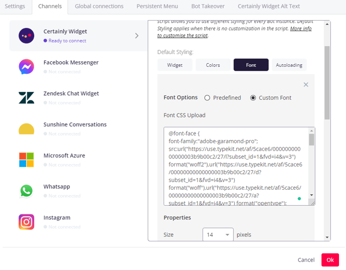
Here, you can see an example font-face declaration for the font "akzidenz-grotesk":
@font-face {
font-family:"akzidenz-grotesk";
src:url("https://use.typekit.net/af/5556ca/000000000000000000013635/27/l?subset_id=1&fvd=n4&v=3") format("woff2"),url("https://use.typekit.net/af/5556ca/000000000000000000013635/27/d?subset_id=1&fvd=n4&v=3") format("woff"),url("https://use.typekit.net/af/5556ca/000000000000000000013635/27/a?subset_id=1&fvd=n4&v=3") format("opentype");
font-display:auto;font-style:normal;font-weight:400;font-stretch:normal;
}

#app {
font-family: akzidenz-grotesk;
}
Message styling
This is where you can get super specific when it comes to aligning with your brand identity and styling preferences!
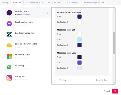
In Bot Settings > Channels > Certainly Widget > Colors, several color options can be selected beyond those we've already discussed in this article. This includes the font and background colors of the bot message buttons, as well as the font, links, and background colors of both the bot and user messages.
And with some simple script adjustments, you can even change the following:
- Color of background and text of Cards
- Border and shadow of Cards
- Background color and box shadows of the widget header
- Background color and border of the user input field
Here is one example of how a bot could be styled differently from the default settings:
You can view all the message styling options in our technical guide to the chatMessage object.
Looking for something not addressed here? Reach out to our Customer Success team!