![certainly-logo-full-colour-rgb-2.png]](https://support.certainly.io/hs-fs/hubfs/certainly-logo-full-colour-rgb-2.png?height=17&name=certainly-logo-full-colour-rgb-2.png)
Our bot message editor features many possibilities to create engaging chatbot messages. In this article, we'll prepare you for the process of setting up conversational messages that are more than monotonous information.
Below, we'll explore:
- Important information to know before you start
- Module's ID and name
- Bot messages and the timer
- Response feature
- Custom feature
- Media elements
- Using emojis
- Changing the font
- Inserting a domain name
- Suggested Replies
- Generic Cards and Dynamic Cards
Once you've edited the messages within your bot's Modules, remember to save your changes. To push these edits to a live chatbot, you must also publish after saving.
Important information to know before you start
Before explaining the bot's message features, here's a quick reminder of how to enter the edit mode of a bot message: you can either double-click on the Module, or you can click the Edit button when hovering over the Module.
Be aware that there are limitations impacting some functionalities, depending on which channel you're using for your bot.
Learn more about these channel limitations.
Here's an overview of the bot message and the available features:
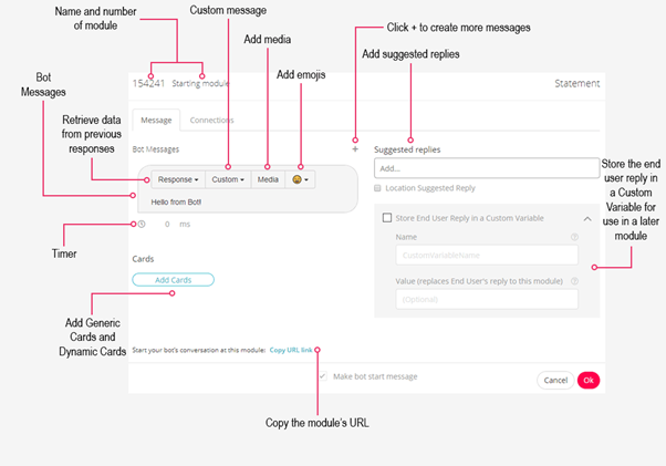
Module's ID and name
At the top of the Module, you can see the Module's ID and name.
You can easily change the name but not the ID. Neither identifier will be visible to the end user, but they are crucial for finding Modules on your platform, connecting Modules to each other, and organizing your bot.
Bot messages and the timer
This is the place where you create chatbot messages. .jpg?width=375&name=botmessagestimer%20(1).jpg)
Add more speech bubbles by clicking the plus in the top right corner.
Create a delay between messages using the timer, indicated by the clock icon below each speech bubble. This delay will give end users time to read a message before the next message is shown. It defines the delay after the message that appears above the typing field for the timer.
The time unit is milliseconds, and as a rule of thumb, we recommend calculating 1000 milliseconds per text line. If the message is rather complex, it might be useful to estimate 1500 milliseconds per text line.
Within a bot message, there are four features: Response, Custom, Media, and Emojis.
Note that your cursor must be in the message field to view these features.
Response feature
The Response feature is valuable to retrieve an end user’s input from a previous message.
For example, if the bot asked an end user for specific information in the previous message, you can retrieve this information in the Module you are working on by selecting Previous Module (previous). This is a helpful feature because it allows you to edit the previous connections in a more flexible manner.
Next to that, you can select the end user's answer to all other Modules you are using on your platform. Look for a desired Module's answer by typing in the Module's ID or name in the search field.
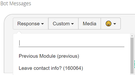
After selecting a Module or the Previous Module (previous), a code written in square brackets appears as illustrated in the following example:
[responseTo module=321321 fallback="sample text"]
The first piece of information within the brackets indicates the Module you'd like to retrieve the answer from, and the second piece of information defines a fallback message.
The fallback message is shown if the end user has not responded to the selected Module (yet). Here you can, for example, define a placeholder that indicates the end user's missing answer within the quotation marks. Everything that is written within the quotation marks will be displayed to the end user if the fallback must be shown.
Take a look at this example:
[responseTo module=321321 fallback="There has not been an answer to that question yet."]
The Response functionality can be valuable if you'd like to make the end user confirm the information before it is used in future actions.
Please note that the Response feature will retrieve the entire previous message of the end user.
Custom feature
Using the Custom feature, you can choose between two options: Variable and Variation.
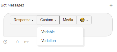
Variable
The first option, Variable, allows you to enter a function into your bot message.
This function makes use of a Custom Variable that you have previously defined, and whose value you would like to show in this message. A variable is a value that can change depending on the information provided by you, the end user, or a third-party API.
Take a look at the default Custom Variable code:
[customVariable key=add_key_here fallback="sample text"]
The first part of the code contains the name of the previously defined variable. The second part refers to a fallback, as explained in the Response feature section above.
To give you an example, you might have collected the end user's name in a previous Module. You can create a more personalized bot message by choosing Custom > Variable > userName (as shown in the following code). You'll also define what will be displayed if no name has been collected – in this case, "mate".
Backend:
Hi [customVariable key=user_name fallback="mate"]!
Frontend (if the saved end user's name is Paul):
"Hi Paul!"
Frontend (if no end user's name has been saved):
"Hi mate!"
Learn more about storing the end user reply in a Custom Variable.
Variation
The Variation option can be used if you'd like to create independent alternatives for your bot's messages. The code is as follows:
[variation="first variation", "second variation", "third variation"]
Variation is helpful within bot messages that are likely to be shown more than once. With this, a more human-like conversation is presented since it prevents the bot from repeating itself. Often, this feature is used for general Modules such as when your bot offers its assistance. You may also create variations for the way the bot says hello.
Take a look at this example:
[variation="How can I help you?", "What is your question?", "What can I help you with?"]
During the conversation, the different variations will be chosen randomly. Therefore, you'll want to make sure that all variations contain the overall same meaning and work independently from each other since only one variation is shown each time the Module is activated.
Media elements
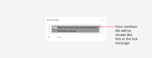
Media elements are a great feature to increase the customer engagement and visual experience of your chatbot visitors. You can add an image, audio, video, or GIF to a message by inserting the media file's URL.
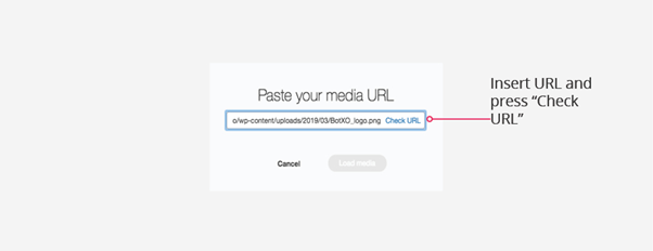
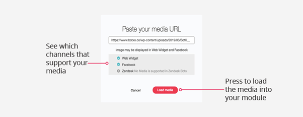
In the editing mode for the specific bot message, you will only find the pasted link of the media file. Therefore, you must always test the Module or conversational flow to see how the media item is displayed for the end user.
Our platform supports the following media formats:
Please note that some chatbot channels do not support all media items.
Find out more about supported media elements across channels.
Using emojis
What would a human conversation be without emotions? Certainly, less exciting.
The chatbot can use emojis to simulate human emotions and ease the conversational flow. The use of emojis is dependent upon your organization's preferences.
Based on our experience, however, the end user experience does benefit from including emojis within the conversation. Select the desired emoji from the panel that appears once you click on the emoji icon.
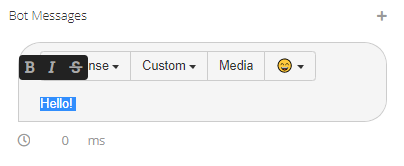
Changing the font
You can change the font of text sections or entire messages by highlighting the desired text.
A window will pop up showing you the options bold, italic, and strike-through.
Take a look at this below:
Using the Certainly Widget, you are also able to adjust the typeface to align with your organization's corporate identity. Go to the right sidebar menu of the bot-building canvas and click on "Bot Settings". Navigation to Channels > Certainly Widget > Font. You can make adjustments here.
Learn more about personalizing the Certainly Widget.
Inserting a domain name
When you insert a domain name in a bot message, it will automatically be rendered as a hyperlink. Use square brackets around the domain name to circumvent this behavior. The square brackets will be visible to the end user, but it will ensure that the link is not clickable.
Here is an example:
[google.com]
If the desired URL contains special characters such as ampersand (&), you must convert the characters into a valid ASCII format.
Suggested Replies
This feature allows you to add answer options for end users. Those suggestions appear as buttons in the conversation and support your chatbot visitors when navigating the available options or topics.
Suggested Replies can interrupt a natural conversational flow. However, Suggested Replies can be very helpful, especially at the beginning of a chatbot conversation or in situations where the end user appears to be lost.
To add Suggested Replies, type in the response options you'd like to be displayed for the user, pressing enter after each one. This allows you to define the conversational journey after users click on these buttons in the Module's connections.
Read more about connecting Suggested Replies.
By using the Suggested Replies feature, you enable a click-based conversational flow. The alternative is AI.
Suggested Replies and AI can be activated in parallel within a Module. With this, the end user has the freedom to choose between typing in a new message or clicking on one of the bot's suggestions.
Learn how to implement AI and use the AI Manager.
Generic Cards and Dynamic Cards
By using Generic and Dynamic cards, you can add visual menus to your bot's conversational flow.
This feature is particularly useful if you'd like to add buttons with images. For example, if your organization promotes different brands, you can use the logo next to the brand’s name to ease the end user’s navigation.
Press the "Add Cards" button to add a Generic or Dynamic card. The difference between the two card types lies in the source of information used for the cards' content.
Generic Cards depend on your input. You define the image to be illustrated, the title, subtitle, and a URL to which the end user is guided after clicking the card. Images will be cropped automatically to fit the card as long as the content is centered vertically.
Find additional information on how to create Generic Cards.
On the other hand, Dynamic Cards use external information embracing a URL, a data script (JSON structure), and a Webhook response.
Read about how to set up Dynamic Cards.